


Photo by Carlos Muza on Unsplash
Finance with Python: USD, Inflation and Stocks in Argentina (2019-2022)


Disclaimer: This is not an investment recommendation, it's for educational purposes only
In this article we see how to make a quick analysis of two of the exchange rates (peso-dollar), the official and the CCL. But first let's see a simple way to get some official data from the Central Bank of Argentina page.
Importing dependencies
import requests
import pandas as pd
import matplotlib.pyplot as plt
Registration on the website of the Central Bank of Argentina and Download data
#Request your own token  in the website: https://estadisticasbcra.com/api/registracion

token = "..."
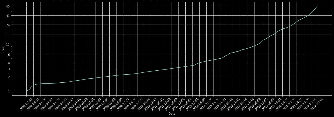
In this case, we download the 'cer' data series, but others options are: 'leliq', 'plazo_fijo', 'uva', 'tasa_badlar', 'merval' or 'merval_usd'.
#cer: in spanish "Coeficiente de Estabilización de Referencia".
#This coefficient has a close relationship with inflation.
endpoint = "cer"
#data to call
url = "https://api.estadisticasbcra.com/"+endpoint
headers = {"Authorization": token}
#Call
data_json = requests.get(url, headers=headers).json()
#Create table with the data
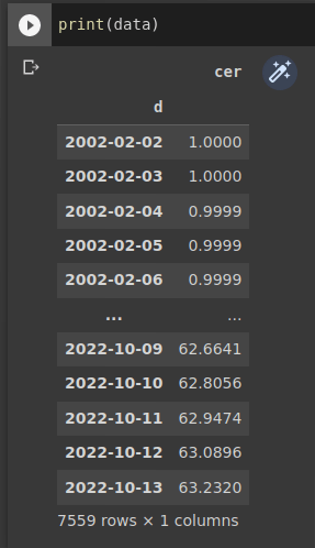
data = pd.DataFrame(data_json)
data.set_index('d', inplace=True, drop=True)
data.columns=[endpoint]
For check the variable 'data', we can print and see it:
The table is fine but plotting the data is much better, of course. With the next lines we define the parameters to do this.
fig, ax = plt.subplots()
plt.rcParams['figure.figsize']=[20,6]
plt.plot(data.index.values,data)
plt.style.use('dark_background')
plt.yscale('log')
ax.yaxis.set_major_formatter(matplotlib.ticker.ScalarFormatter())
ax.set_yticks(np.geomspace(data.min(),data.max(),10).round())
#ticks in x-axis each six month
ax.set_xticks(data.index[0:-1:180])
ax.grid(True)
plt.xticks(rotation=45)

plt.xlabel('Date')
plt.ylabel(endpoint)
plt.show()
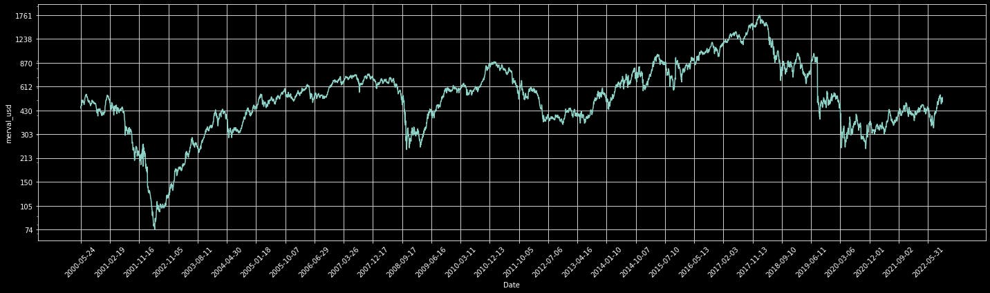
Instead of using "cer", we can download the Merval Index ($IMV) expressed in dollars (USD_CCL) with the expression "merval_usd". IMV is the index of the most importants argentine stocks.
import yfinance as yf
import matplotlib.pyplot as plt
import pandas as pd
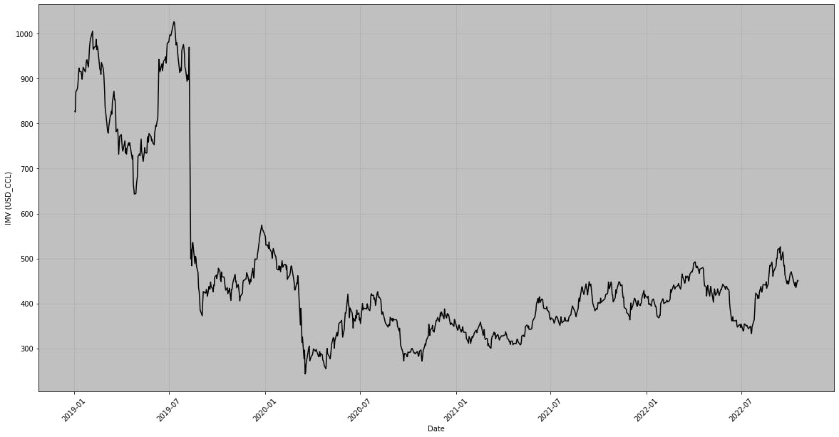
IMV_P=yf.download('M.BA',start=start1,end=end1)
IMV_P.index=IMV_P.index.strftime('%Y-%m-%d')
IMV_USD=(IMV_P['Close']/ccl_ggal).dropna()
IMV_USD.index=pd.to_datetime(IMV_USD.index)
fig, axs = plt.subplots( figsize=(20,10))
plt.axes().set_facecolor('silver')
plt.plot(IMV_USD.index.values[IMV_USD.index!='2022-07-14'], IMV_USD[IMV_USD.index!='2022-07-14'],color='black',linestyle='-')
#ticks in x-axis each six month
plt.xticks(rotation=45)
axs.set_xticks(IMV_USD.index[0:-1:180])
plt.grid(True)
plt.ylabel('IMV (USD_CCL)')
plt.xlabel('Date')
def gap(start,end):
'''
Install yfinance
Date Format YYYY-MM-DD
USD_CCL with GGAL y GGAL.BA
Definition of global variable: ccl_ggal
'''
##Import Packages##
import pandas as pd
import yfinance as yf
import matplotlib.pyplot as plt
###################
global ccl_ggal
name= 'GGAL'
ggal_p=yf.download(name+'.BA',start=start, end=end)
ggal_usd=yf.download(name,start=start, end=end)
#Change the date format
ggal_p.index=ggal_p.index.strftime('%Y-%m-%d')
ggal_usd.index=ggal_usd.index.strftime('%Y-%m-%d')
ccl_ggal= 10*ggal_p['Close']/ggal_usd['Close']
ccl_ggal=ccl_ggal.dropna()
usdars=yf.download('ARS=X',start=start, end=end)
usdars.index=usdars.index.strftime('%Y-%m-%d')
print('#-----------------------------------------#')
print(' GAP USD_CCL/USDARS using ' +name+' ')
print('#-----------------------------------------#')
brecha=100*(ccl_ggal-usdars['Close'])/usdars['Close']
brecha=brecha.dropna()
brecha=pd.DataFrame(brecha)
brecha.set_index(brecha.index)
brecha.index=pd.to_datetime(brecha.index)
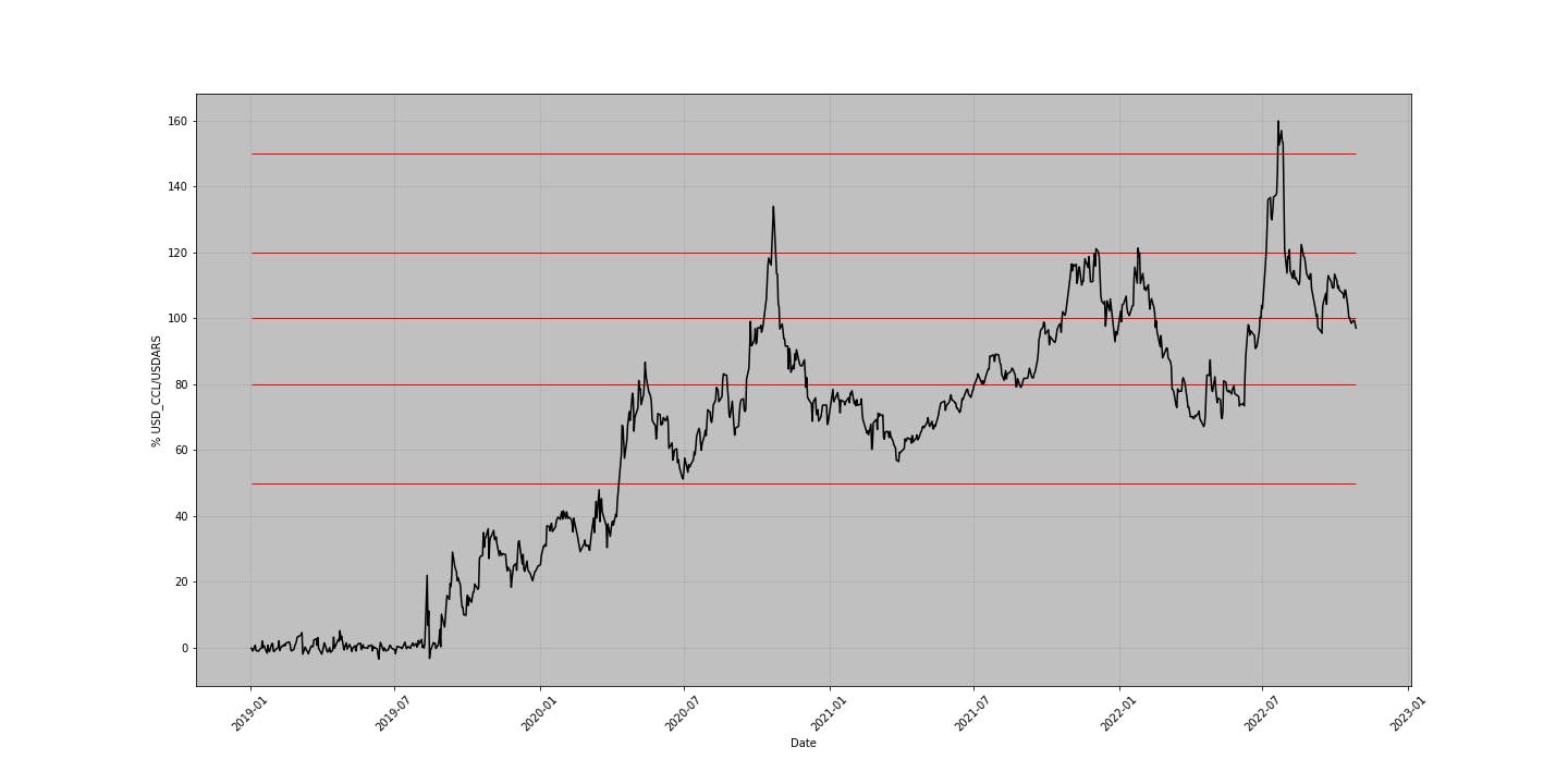
fig, axs = plt.subplots( figsize=(20,10))
plt.axes().set_facecolor('silver')
plt.plot(brecha.index.values, brecha,color='black',linestyle='-')
plt.hlines([50,80,100,120,150],brecha.index[0],brecha.index[-1],color='red',linestyle='-',linewidth=1)
#ticks in x-axis each six month
plt.xticks(rotation=45)
axs.set_xticks(brecha.index[0:-1:180])
plt.grid(True)
plt.ylabel('% USD_CCL/USDARS')
plt.xlabel('Date')
WIth the command gap?, return the next description about the function:
Signature: gap(start, end)
Docstring:
Install yfinance
Date Format YYYY-MM-DD
USD_CCL with GGAL y GGAL.BA
Definition of global variable: ccl_ggal
File:      /content/<ipython-input-1-14077ca0da4e>
Type:      function
For example, if we execute the following line with the chosen date range:
start='01/01/2019'
end='28/10/2022'
gap(start,end)
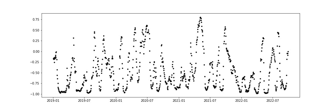
import numpy as np
import matplotlib.pyplot as plt

ccl_ggal.index=pd.to_datetime(ccl_ggal.index)

correlation=np.zeros(len(ccl_ggal)-19)
for i in range(20,len(ccl_ggal)):
  correlation[i-20]=IMV_USD[i-20:i].corr(ccl_ggal[i-20:i])

plt.figure(figsize=(15,5))
plt.plot(ccl_ggal.index.values[0:len(correlation)],correlation,'k.')
print('#'*50)
print('The mean between '+start+' and '+end+' is:')
print(round(np.mean(correlation),2))
print('#'*50)
The mean between '01/01/2019' and '28/10/2022' is: -0.47
Thank you very much and see you in a next post.
Quick Conclusions
Clean Codes
https://github.com/nicorag/finance/tree/main/datos_bcra.ipynb
https://github.com/nicorag/finance/tree/main/programs/IMV-CER-USD.py