


Photo by Patrick Weissenberger on Unsplash
Finance with Python: Buy an ETF from Argentina
Disclaimer: This is not an investment recommendation, it's for educational purposes only.


In this article I wanted to combine my interest in finance with the programming language that I like the most (Python). The idea is to be able to analyze a type of financial asset, called an ETF, which can now be purchased with Argentine pesos through a Cedear. But, what is an ETF? what is a Cedear?...
Some definitions
ETF: An exchange-traded fund (ETF) is a type of pooled investment security that operates much like a mutual fund. Typically, ETFs will track a particular index, sector, commodity, or other asset. The most popular is SPY, which follow the "Standard&Poor´s 500 Index" of USA.
Cedear: The Argentine Depository Receipts are variable income instruments that are listed on the Buenos Aires Stock Exchange (BCBA) and represent shares that are not publicly offered or listed on the Argentine market, but on a stock exchange in another country. In general, the conversion ratio between a stock/ETF and its associated Cedear isn't 1:1. And another important aspect to consider is that since the Cedear is quoted in Argentine pesos, it has an implicit exchange rate with the dollar.
The next code is developed in Google Colab:
1. Installing and importing dependencies
!pip install yfinance
import math
import numpy as np
import pandas as pd
import pandas_datareader as web
import matplotlib.pyplot as plt
import matplotlib
import yfinance as yf
from datetime import date
2. ETF Cedear (Until July 2022)
In this moment, there are nine ETF with Cedear. That is why we define a list with the Ticker (the name) of each other.
ETF_Cedear=['SPY','QQQ','DIA','IWM','EEM','EWZ','XLE','XLF','ARKK']
print('For investors in Argentine: There are 9 ETFs with Cedears (available to buy with Argentine pesos)')
print(ETF_Cedear)

Brief description of each ETF
Ticker: SPY
It follow the Standard&Poor's 500 Index. This index represents the 500 largest companies in the USA by market capitalization. The ETF started operating in 1993.
Ticker: QQQ
This ETF tracks the Nasdaq 100 index, a technologic index that represents the 100 largest companies in the USA. It started operating in 1999.
Ticker: DIA
A ETF that tracks the Dow Jones Industrial Average Index. That only have 30 stocks, some of these are Coca-Cola (KO), IBM and Pfizer (PFE). In general, it presents less volatility than the SPY and QQQ. Began operating in 1998.
Ticker: IWM
The iShares Russell 2000 ETF seeks to track the investment results of an index composed of 2000 small-capitalization U.S. equities. It started operating in 2000.
Ticker: EEM
The iShares MSCI Emerging Markets ETF seeks to track the investment results of an index composed of large- and mid-capitalization emerging market equities. Operating since 2003
Ticker: EWZ
The iShares MSCI Brazil ETF seeks to track the investment results of an index composed of Brazilian equities. Vale do Rio Doce (Vale) and Petrobras (PBR) are the most representative for this ETF (both relate with commodities). Operating since 2000
Ticker: XLE
It tracks an index of S&P 500 energy stocks, weighted by market cap. Operating since 1998
Ticker: XLF
It tracks an index of S&P 500 financial stocks, weighted by market cap. Operating since 1998
Ticker: ARKK
It is the flagship index of the well-known fund manager Cathie Wood. This is the only active management index, and the companies that make it up promise high performance in disruptive sectors (high risk). Started operating in 2014
Choise 1 ETF with the index (between 0-8)
choise=ETF_Cedear[0]
etf=yf.download(choise,start='2015-01-01',end=date.today(),progress=False)
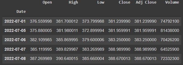
etf.tail()
Then we see the last five values for each column (Open Price, High Price, Low Price, Close Price, Adjust Close Price and Volume):
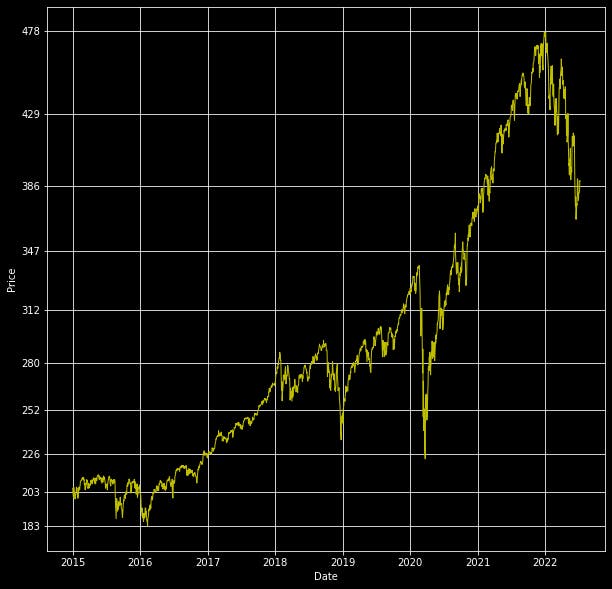
Right now, we could plot the close price since 2015 (in this example).
fig, ax = plt.subplots()
plt.plot(etf['Close'],'y',lw=1)
plt.style.use('dark_background')
plt.rcParams['figure.figsize']=[20,5]
ax.yaxis.set_major_formatter(matplotlib.ticker.ScalarFormatter())
ax.set_yticks( np.geomspace(etf['Close'].min(),etf['Close'].max(),10).round() )
plt.grid(True)
plt.xlabel('Date')
plt.ylabel('Price')
plt.show()
3. Some statistics parameters
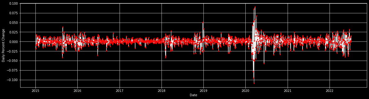
To make more rigorous analyzes it is necessary to calculate some statistical parameters. As a first step, for to graph the daily returns of the asset we are interested in:
etf['Return']=etf['Close']/etf['Close'].shift(1)-1
plt.plot(etf['Return'],'w',lw=1)
plt.plot(etf['Return'],'r.')
plt.style.use('dark_background')
plt.rcParams['figure.figsize']=[20,5]
plt.grid(True)
plt.xlabel('Date')
plt.ylabel('Daily Percent Change')
plt.show()
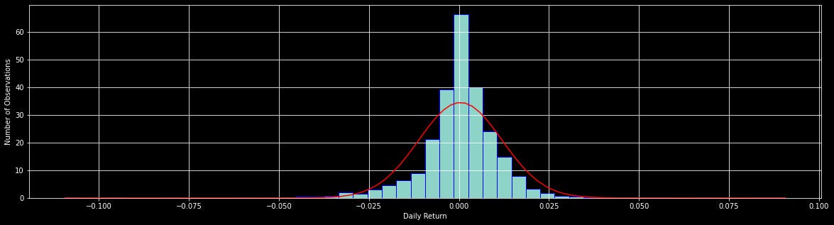
With the following code (the three first lines) we can calculate some of the most relevant statistics, but here I will only show one way to obtain them. Understanding and analyzing them I will leave for another article.
from scipy import stats
from scipy.stats import norm
print('Stats Returns: ',stats.describe(etf['Return'][1:]))

import matplotlib.mlab as math
Return=etf['Return'][1:]
plt.hist(Return,edgecolor='blue',density=True,bins=50)
meanR= float(np.mean(Return))
sdevR= float(np.std(Return))
minR= float(np.min(Return))
maxR= float(np.max(Return))
x= np.linspace(minR,maxR,100)
plt.plot(x,norm.pdf(x,meanR,sdevR),'red')
plt.grid(True)
plt.xlabel('Daily Return')
plt.ylabel('Number of Observations')
plt.show()
Comparing the histograms with a Gaussian distribution is a standard step to understand the behavior of the returns of the analyzed asset.
4. Correlating stock returns using Python:
The correlation between stocks is an interesting and easy application to implement in python. First, Import libraries and select a list of stocks to correlate (9 ETFs in this case)
!pip install yfinance
import yfinance as yf
import numpy as np
import pandas as pd
#used to grab the stock prices, with yahoo
import pandas_datareader as web
from datetime import datetime,date
#to visualize the results
import matplotlib.pyplot as plt
import matplotlib
import seaborn

#select start date for correlation window as well as list of tickers
start = datetime(2015, 1, 1)
symbols_list = ['SPY','QQQ','DIA','IWM','EEM','EWZ','XLE','XLF','ARKK']
Pull stock prices, push into clean dataframe
#array to store prices
symbols=[]
#pull price using iex for each symbol in list defined above
for ticker in symbols_list:
r=yf.download(ticker,start=start,end=date.today(),progress=False)
# add a symbol column
r['Symbol'] = ticker
symbols.append(r)
# concatenate into df
df = pd.concat(symbols)
df = df.reset_index()
df = df[['Date', 'Close', 'Symbol']]
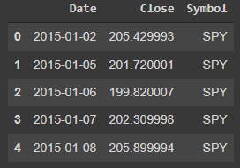
df.head()
 However, we want our symbols represented as columns so we'll have to pivot the dataframe:
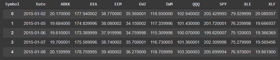
df_pivot = df.pivot('Date','Symbol','Close').reset_index()
df_pivot.head()
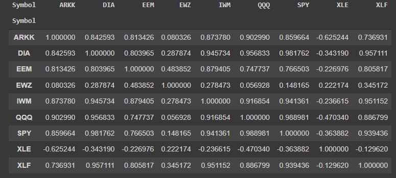
Next, we can run the correlation. Using the Pandas 'corr' function to compute the Pearson correlation coeffecient between each pair of equities
corr_df = df_pivot.corr(method='pearson')
#reset symbol as index (rather than 0-X)
corr_df.head().reset_index()
corr_df.head(10)
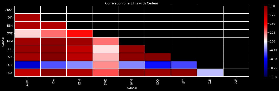
Finally, we can plot a heatmap of the correlations to better visualize the results:
#take the bottom triangle since it repeats itself
mask = np.zeros_like(corr_df)
mask[np.triu_indices_from(mask)] = True
#generate plot
seaborn.heatmap(corr_df, cmap='seismic', vmax=1.0, vmin=-1.0 , mask = mask, linewidths=1)
plt.yticks(rotation=0)
plt.xticks(rotation=90)
plt.rcParams['figure.figsize']=[5,5]
plt.title('Correlation of 9 ETFs with Cedear')
plt.show()
5. A quick analysis
Some quick conclusions from this graph, for the time interval analyzed, are: EWZ (Brazil, an emerging country and the most important in South America) is the only one with a positive correlation with XLE (US energy companies, mainly Chevron and Exxon, which represent a good measure for this ETF). XLE is inversely correlated with tech ETFs like QQQ (Nasdaq) and ARKK (Cathie Woods ETF). These are some aspects to consider if we want to build an investment portfolio with this instruments.
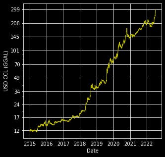
6. Plotting one of the possible dollars in Argentina
Without going into details, we will calculate the implied dollar using GGAL, the Argentine stock with the highest volume of operations (listed in Argentina and USA). For the calculation, we know that 10 shares in Argentina are equivalent to one in the USA...
ggal_USD=yf.download('GGAL',start='2015-01-01',end=date.today(),progress=False)
ggal_PES=yf.download('GGAL.BA',start='2015-01-01',end=date.today(),progress=False)
CCL=ggal_PES['Close']*10/ggal_USD['Close']
CCL=CCL.dropna()
print(CCL)
fig, ax = plt.subplots()
plt.plot(CCL,'y',lw=1)
plt.style.use('dark_background')
plt.rcParams['figure.figsize']=[10,10]
plt.yscale('log')
ax.yaxis.set_major_formatter(matplotlib.ticker.ScalarFormatter())
ax.set_yticks( np.geomspace(CCL.min(), CCL.max(),10).round() )

plt.grid(True)
plt.xlabel('Date')
plt.ylabel('USD CCL (GGAL)')
plt.show()
In another article we can graph several of the exchange rates, but for now you can see and analyze the USD_CCL:
Thank you very much for coming here. See you later...
The Complete Code
#This is a code merge, that is why some lines are duplicated.
#If you wish, you can copy the parts that interest you the most.

!pip install yfinance
import math
import numpy as np
import pandas as pd
import pandas_datareader as web
import matplotlib.pyplot as plt
import matplotlib
import yfinance as yf
from datetime import date
ETF_Cedear=['SPY','QQQ','DIA','IWM','EEM','EWZ','XLE','XLF','ARKK']
print('For investors in Argentine: There are 9 ETFs with Cedears (available to buy with Argentinian Pesos)')
print(ETF_Cedear)
# Choise 1 ETF with the index (between 0-8)
choise=ETF_Cedear[0]
etf=yf.download(choise,start='2015-01-01',end=date.today(),progress=False)
etf.tail()
fig, ax = plt.subplots()
plt.plot(etf['Close'],'y',lw=1)
plt.style.use('dark_background')
plt.rcParams['figure.figsize']=[20,5]
ax.yaxis.set_major_formatter(matplotlib.ticker.ScalarFormatter())
ax.set_yticks( np.geomspace(etf['Close'].min(),etf['Close'].max(),10).round() )
plt.grid(True)
plt.xlabel('Date')
plt.ylabel('Price')
plt.show()

#Para graficar los retornos diarios del activo que nos interesa:
etf['Return']=etf['Close']/etf['Close'].shift(1)-1
plt.plot(etf['Return'],'w',lw=1)
plt.plot(etf['Return'],'r.')
plt.style.use('dark_background')
plt.rcParams['figure.figsize']=[20,5]
plt.grid(True)
plt.xlabel('Date')
plt.ylabel('Daily Percent Change')
plt.show()

#Para saber los datos estadísticos del activo en cuestión
from scipy import stats
from scipy.stats import norm
print('Stats Returns: ',stats.describe(etf['Return'][1:]))

import matplotlib.mlab as math
Return=etf['Return'][1:]
plt.hist(Return,edgecolor='blue',density=True,bins=50)
meanR= float(np.mean(Return))
sdevR= float(np.std(Return))
minR= float(np.min(Return))
maxR= float(np.max(Return))
x= np.linspace(minR,maxR,100)
plt.plot(x,norm.pdf(x,meanR,sdevR),'red')
plt.grid(True)
plt.xlabel('Daily Return')
plt.ylabel('Number of Observations')
plt.show()


import yfinance as yf
import numpy as np
import pandas as pd
#used to grab the stock prices, with yahoo
import pandas_datareader as web
from datetime import datetime,date
#to visualize the results
import matplotlib.pyplot as plt
import matplotlib
import seaborn

#select start date for correlation window as well as list of tickers
start = datetime(2015, 1, 1)
symbols_list = ['SPY','QQQ','DIA','IWM','EEM','EWZ','XLE','XLF','ARKK']
#array to store prices
symbols=[]
#pull price using iex for each symbol in list defined above
for ticker in symbols_list:
  r=yf.download(ticker,start=start,end=date.today(),progress=False)
  # add a symbol column
  r['Symbol'] = ticker
  symbols.append(r)
# concatenate into df
df = pd.concat(symbols)
df = df.reset_index()
df = df[['Date', 'Close', 'Symbol']]
df.head()
df_pivot = df.pivot('Date','Symbol','Close').reset_index()
df_pivot.head()
corr_df = df_pivot.corr(method='pearson')
#reset symbol as index (rather than 0-X)
corr_df.head().reset_index()
corr_df.head(10)
#take the bottom triangle since it repeats itself
mask = np.zeros_like(corr_df)
mask[np.triu_indices_from(mask)] = True
#generate plot
seaborn.heatmap(corr_df, cmap='seismic', vmax=1.0, vmin=-1.0 , mask = mask, linewidths=1)
plt.yticks(rotation=0)
plt.xticks(rotation=90)
plt.rcParams['figure.figsize']=[5,5]
plt.title('Correlation of 9 ETFs with Cedear')
plt.show()
ggal_USD=yf.download('GGAL',start='2015-01-01',end=date.today(),progress=False)
ggal_PES=yf.download('GGAL.BA',start='2015-01-01',end=date.today(),progress=False)
CCL=ggal_PES['Close']*10/ggal_USD['Close']
CCL=CCL.dropna()
print(CCL)
fig, ax = plt.subplots()
plt.plot(CCL,'y',lw=1)
plt.style.use('dark_background')
plt.rcParams['figure.figsize']=[10,10]
plt.yscale('log')
ax.yaxis.set_major_formatter(matplotlib.ticker.ScalarFormatter())
ax.set_yticks( np.geomspace(CCL.min(), CCL.max(),10).round() )

plt.grid(True)
plt.xlabel('Date')
plt.ylabel('USD CCL (GGAL)')
plt.show()